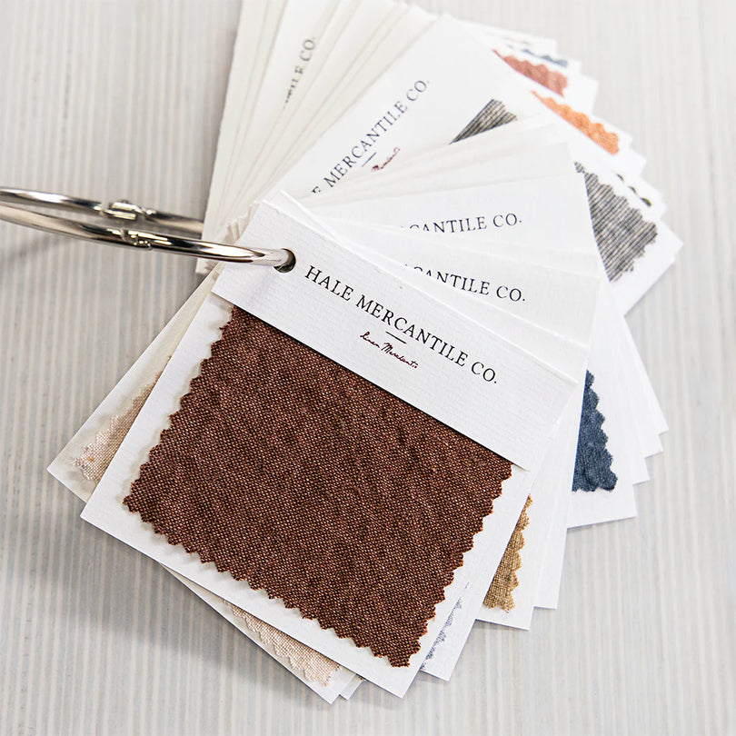
HMCo linen is prewashed and softened to achieve a natural aged patina. Colour within any one article can be muted in places as a result. This is not a fault in our linen. It is done with intention to achieve our relaxed, aged style.
Pending on availability, the European flax used to spin our yarns can vary from the grower. This can at times affect the dye lot within our yarns. Dye lot variation is common in processing natural fibres. Whilst we do our utmost to avoid this there can at times be slight variances to any colour within the HMCo range. We have offered some additional descriptions of our linen palette that may assist when selecting a colour.
Our blanket collection is woven from a blend of cotton and linen. As a result, these products go through a different dyeing process to our 100% linen products. Slight variations in colour will be apparent between our pure linen and blended products.
If you require additional help with your selection or would like to request colour swatches please contact us at customer-service@halemercantileco.com
Alba: a light stone likened to washed river pebble
Argent: a soft silvery sage reminiscent of the lovable Lamb’s-ear perennial
Armee: reminiscent of lush remote pastures, likened to a deep Khaki
Ayrton: a classic antique white
Azzura: a cool, mid-toned coastal blue melange
Bateau: a deep navy melange with a subtle teal undertone
Bere: a wonderfully inviting warm chocolate brown
Brun: a beautifully rich toffee tone, blended with our signature Sable hue to create a subtle melange
Carmel: our version of a sun-bleached caramel tone
Cep: a warm and neutral classic taupe
Elk: a light and cool mid brown
Fog: a pale grey with a subtle blue undertone
Floss: the palest earthy pink, reminiscent of fairy floss
Fonda: a deep sea blue
Fysk: a combination of Sable and a natural linen colour make an earthy wheat shade
Gris: a cool, soft light grey
Kali: a sandy grey mélange with a warm undertone.
Maiz: a muted, washed out gold
Mare: an oceanic hue that fills the space between green and blue
Moro: a softened, muted mulberry
Nox: black and our Sable colours are combined to create a muted black melange
Oro: a soft and muted saffron
Petra: not a white or cream, rather a very pale stone. The perfect hue when one does not want to fuss over keeping whites white
Porto: burnt orange and Sable are combined for a softer version of tangerine
Quill: intense pink current, yet muted and earthy
Rosa: a dense clay pink, earthy and warm
Rok: a mid-grey mélange mixed with Tempest, our classic charcoal, & blended with a touch of Sable
Roy: a washed, dusty cornflower blue
Russo: a rich, yet earthy rust tone
Sable: a warm, light sandy colour
Silva: a deep emerald green from farway forrest
Tempest: a cool grey, classic mid-toned charcoal


